
Design System Cuts New-Feature Development Time from Days to Hours
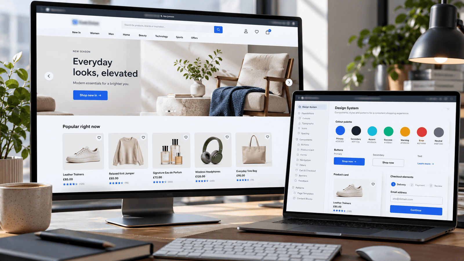
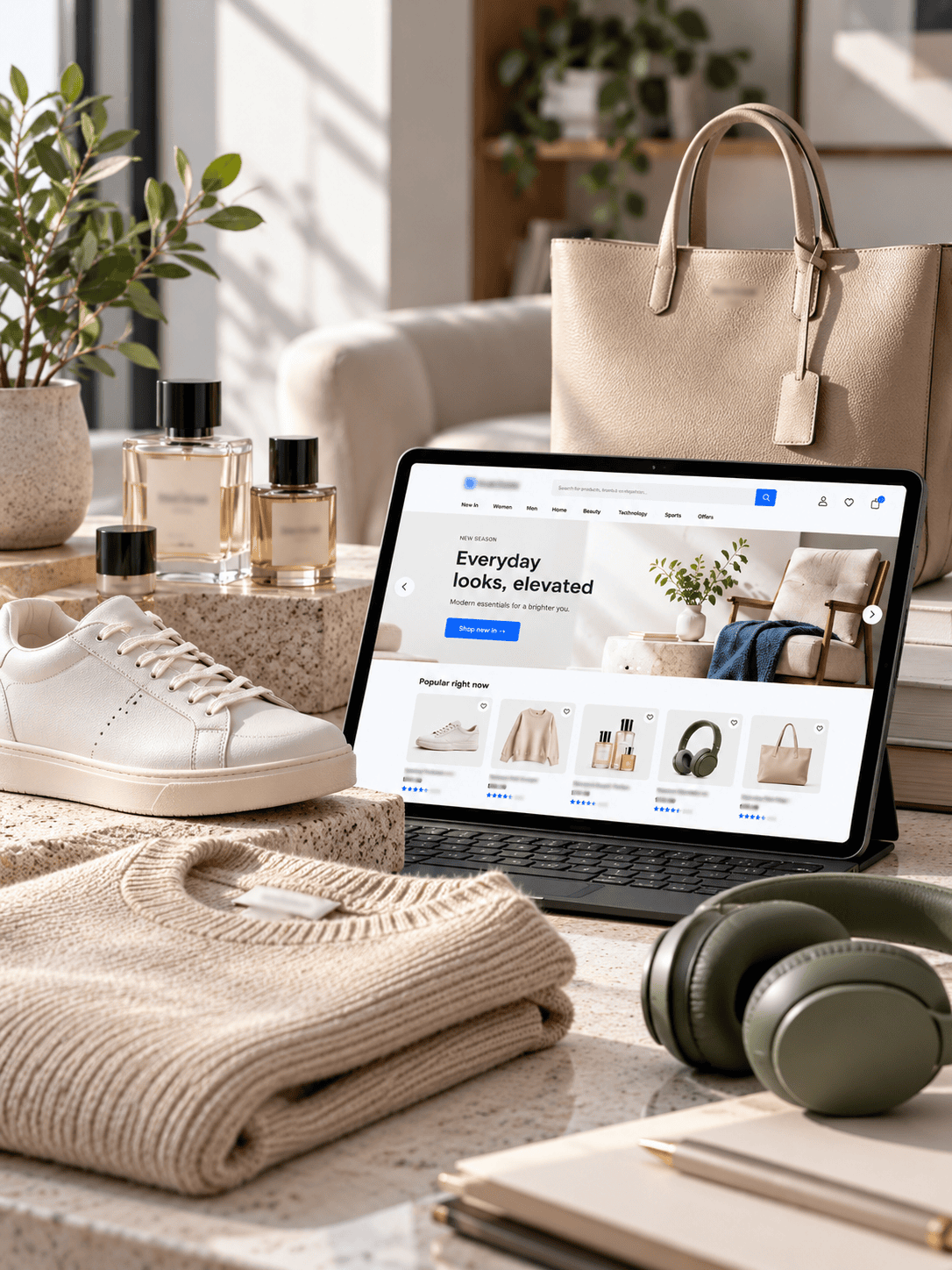
We partnered with a rapidly growing UK e-commerce brand to build a scalable design system from scratch, creating 40+ reusable components and drastically reducing developer overhead.
About the Client
Client identity withheld per NDA. A high-traffic UK-based e-commerce retailer was struggling to maintain visual consistency and rapid feature deployment across their web and mobile storefronts as their engineering team scaled.
Inconsistent UI and Slow Deployment
A lack of centralized design components was severely bottlenecking the engineering team.
As the client's product team grew, their lack of a centralized component library caused massive bottlenecks. Designers were recreating buttons and product cards, while developers were wrestling with conflicting CSS classes. This "wild west" approach meant that deploying even a simple checkout tweak took days instead of hours, killing their agility.
What We Set Out to Achieve
Measurable goals agreed with the client before kickoff.
How We Got From Problem to Result
The process followed from kickoff to launch.
Audit & Inventory
Cataloging hundreds of inconsistent buttons, colors, and typography styles.
Foundations
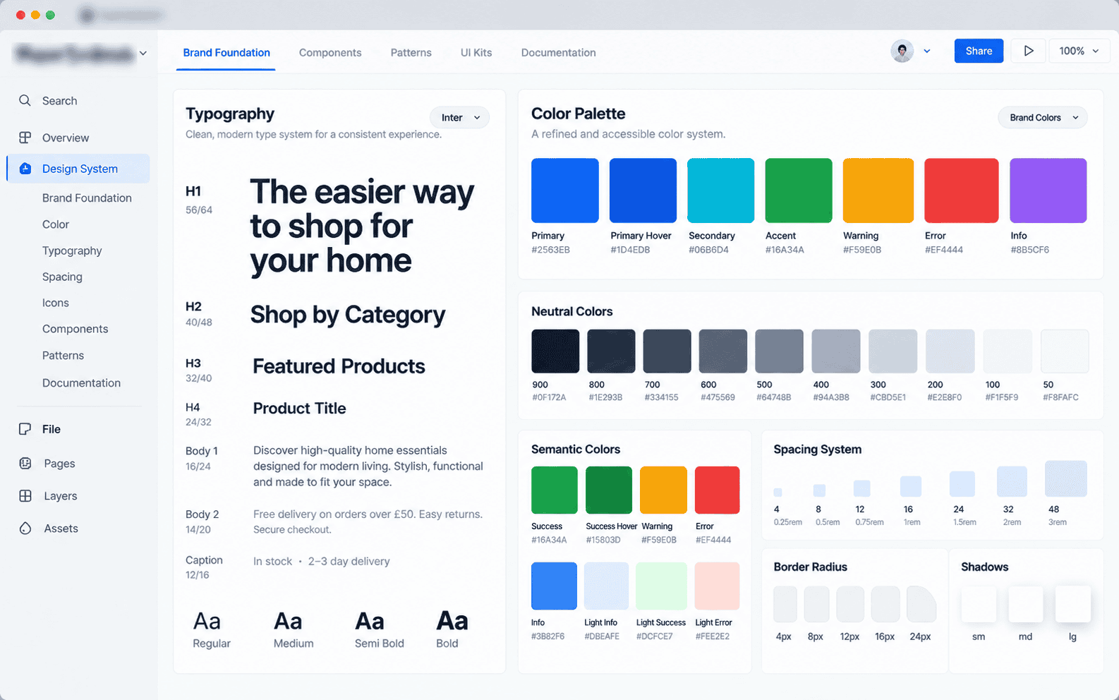
Defining global variables (colors, typography, spacing, shadows).
Component Library
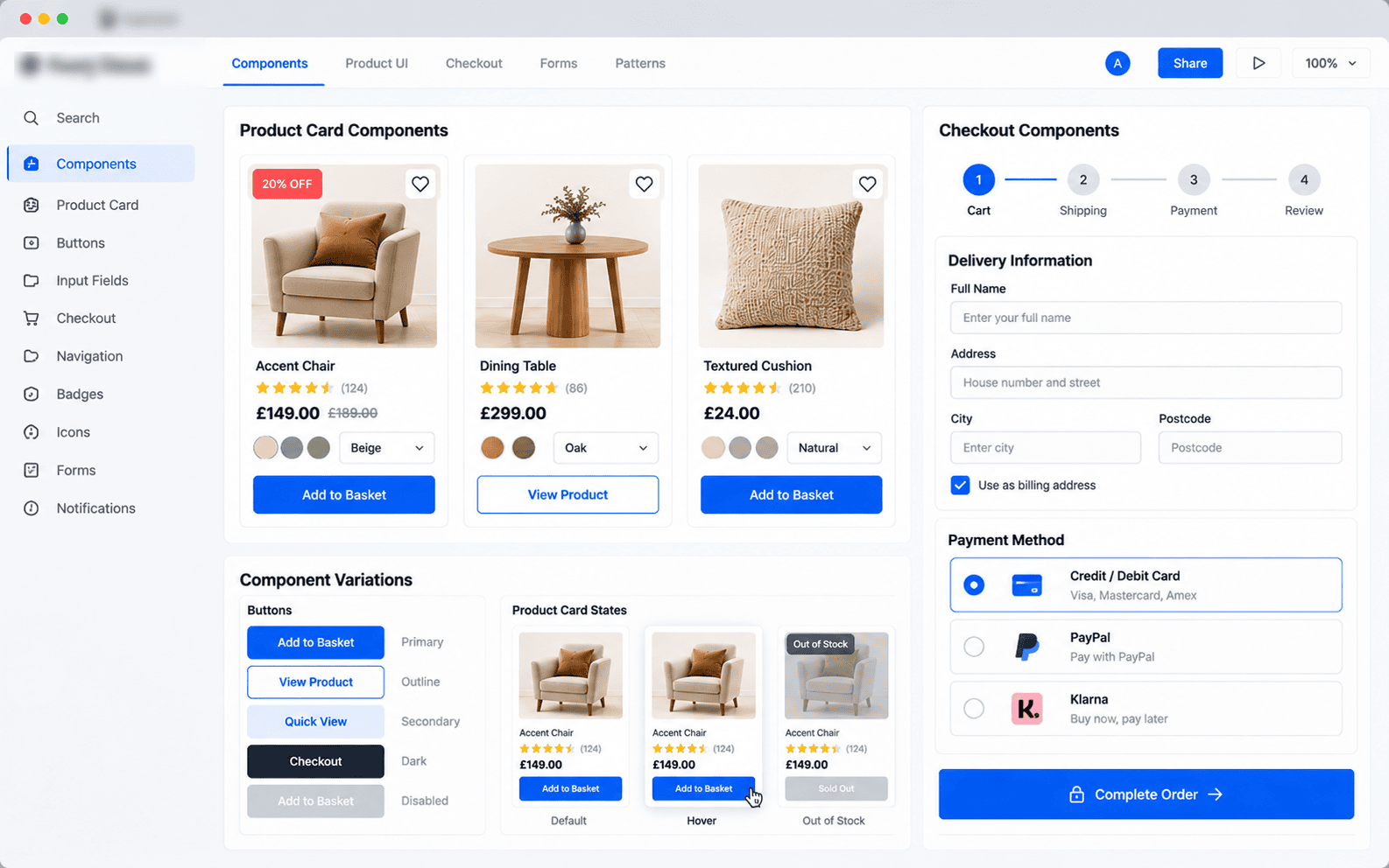
Designing 40+ modular components with states and variants.
Documentation
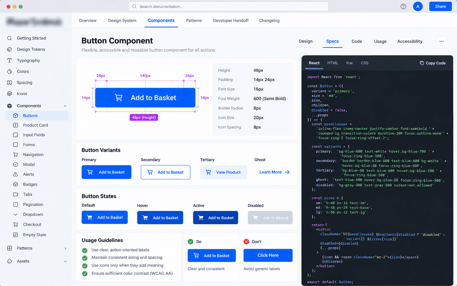
Writing clear usage guidelines for designers and developers.
Implementation
Syncing Figma variables directly with the frontend team's codebase.
Handoff
Training the client's product team on the new streamlined workflow.
What We Designed It With
Before & After
Screens shown are representative mockups. Live product link withheld per NDA.
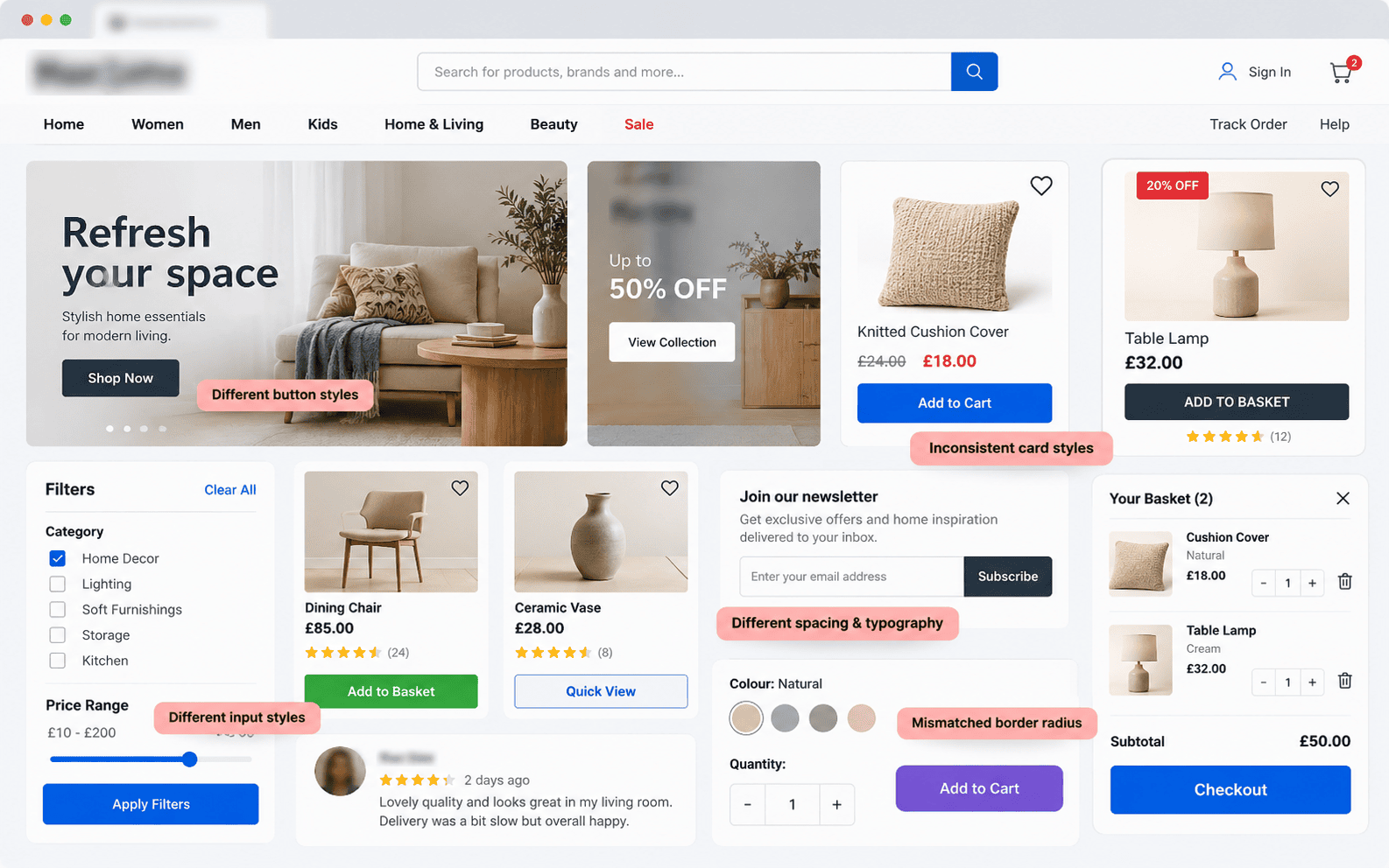
Before: Fragmented and inconsistent UI elements
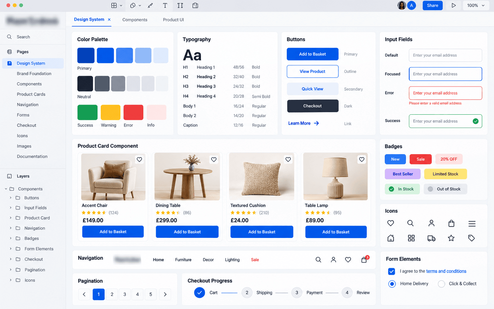
After: Standardized, unified component library
Numbers From the Real Campaign
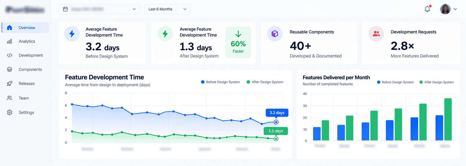
Metrics measured post-launch, compared against baseline.
What the Client Had to Say
"Client feedback is kept confidential under our client agreement. The new design system revolutionized how our product team operates. What used to take developers a week to build now takes an afternoon, and the brand finally looks cohesive."
How Long It Took
Want Results Like This for Your Business?
Let's talk about your project and how we can help you get there.